Bullet Journal Headers: Easy Title Styles Without Calligraphy
Six header styles that rely on shapes instead of handwriting skill, a ribbon banner drawn in four steps, a counting trick for centering and a three-level hierarchy for consistent pages.

Tutorial at a glance
Materials
- Pencil and eraser
- 0.3 mm fineliner
- 0.5 or 0.8 mm pen for lettering
- Mild-color highlighter
- 6-inch (15 cm) ruler
Bullet journal headers do not depend on beautiful handwriting. A plain word in capital letters looks finished as soon as it sits inside a clear shape, so the shape does the work and your everyday lettering is enough.
Below are six header styles built from rectangles, lines and dots, a ribbon banner drawn step by step and a simple hierarchy that keeps every page of your notebook consistent.
Let the shape do the work
A header has one job: to tell you what the page or section is before you read anything else. Size, weight and a frame all do that without calligraphy. For the letters themselves, three habits are enough:
- Write in capitals. They share one height, so they line up between two rows of dots.
- Keep letters 2 squares tall for a page title and 1 square tall for a section title.
- Leave a small, even gap between letters. Slightly wide spacing reads as deliberate.
Pencil the word first, then draw the shape around it. Doing it the other way round is how words end up squeezed against the right edge.
Six header styles without calligraphy
- Ribbon banner. A rectangle with a folded tail on each side. The most decorative of the six; the steps are below.
- Boxed. A ruled rectangle around the word, with 1 square of space on every side. For extra weight, redraw the bottom and right edges a little thicker to suggest a shadow.
- Double underline. Two parallel lines under the word, half a square apart. The fastest style, and a good one for daily dates.
- Highlighter swash. One stroke of a mild-color highlighter, with the word written over it once it is dry. Draw the stroke first: highlighter over fresh ink can smear.
- Dotted frame. A rectangle made of evenly spaced dots instead of a solid line. On a dot grid, place one dot on each grid dot and one between.
- Flag. A rectangle with a V notch cut into the right end, as if it hangs from a pole on the left. It suits short words and dates.
Pick two of these for a whole notebook, one for page titles and one for sections. A page that mixes four header styles looks busier than a page with none.
Step by step: a ribbon banner
The banner looks complicated but is made of one rectangle, two smaller shapes and two triangles. Work in pencil until the last step.
- Draw the main rectangle. Make it 3 squares tall and as wide as your word plus 1 square on each side. Twelve squares wide suits most short titles.
- Add the two tails. On each side, draw a smaller rectangle 2 squares wide and 3 tall, set 1 square lower than the main one and tucked 1 square behind it. Cut a V notch into its outer end.
- Join them with triangles. On each side, draw a short diagonal from the bottom corner of the main rectangle down and inward to the bottom inner corner of the tail. This small triangle is the fold.
- Ink and shade. Go over the outline with a fineliner, erase the pencil when the ink is dry and fill the two fold triangles solid or with close diagonal lines. Add a light color to the tails if you like.
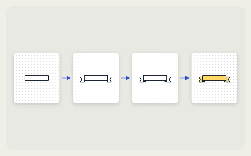
The fold triangles are what make the banner read as a ribbon. If your first attempts look flat, check that the tails sit lower than the main rectangle and that the triangles are shaded darker than everything else.
Centering a word without measuring
The dot grid turns centering into counting. Count the letters in your word, including spaces, and allow 1 square per letter for small headers or 2 squares per letter for large ones. Subtract that from the number of squares across your page, halve the remainder and start that many squares in from the left edge.
For example, an eight-letter word at 2 squares per letter needs 16 squares. On a page 26 squares wide, that leaves 10, so the word starts 5 squares in. Pages vary, so count your own before you rely on a number. A short clear ruler helps keep the baseline straight; see how to use a ruler in a bullet journal for the technique.
Watch out
Narrow letters such as L and T take less room, and wide ones such as M and W take more. Pencil the whole word before inking so you can shift it a square if needed.
Header hierarchy for a consistent page
Hierarchy means that the importance of a line is visible from its size. Three levels cover nearly every page:
| Level | Size | Style |
|---|---|---|
| Page title | 2 squares tall | Banner, box or flag |
| Section header | 1 square tall | Capitals with an underline |
| Body text | Normal handwriting | No decoration |

Use the same three levels on every spread. A simple weekly spread, for instance, needs one page title for the week and seven small day headers that all match. Consistency also speeds up drawing, because you stop deciding how each title should look.
Leave one blank row of squares under every header before the first entry. That gap separates the title from the content more clearly than a thicker line would.
Pens and color for headers
Use one tip size for outlines and a thicker one for the lettering: a 0.3 mm fineliner for the shape and a 0.5 or 0.8 mm tip for the word gives clear contrast. The overview of the best pens for bullet journaling explains tip sizes and how to check a pen for bleeding.
Color works best when it is limited. One header color for the whole month, repeated on every page, ties the spreads together. If you want help choosing it, the guide to bullet journal color palettes shows how to combine a neutral, a main color and an accent.
When a header goes wrong, the shape is also the fix. A misspelled word inside a box can be covered with a paper patch cut to the size of the box, and a crooked underline becomes a double underline with one extra ruled stroke.
Frequently asked questions
How do I make headers look neat if my handwriting is messy?
Write in capital letters of a fixed height, using the dot grid as top and bottom guides, and pencil the word before inking. Then put a simple shape around it, such as a box or banner. The frame gives the page structure, so the lettering only has to be readable.
How do I center a header on a dot-grid page?
Count the squares your word needs, subtract that from the number of squares across the page and halve the result. Start writing that many squares in from the left. Pencil the word first, because wide and narrow letters can shift the result by a square.
How many header styles should I use?
Two is usually enough: one for page titles and one for sections inside a page. Using the same pair through the whole notebook makes pages quicker to draw and easier to scan. Change the color from month to month if you want variety without changing the shapes.