Bullet Journal Color Palettes: How to Pick Colors That Work
Pick a small bullet journal color palette that works: one neutral, one main color and one accent, with four example palettes, a swatch page and clear rules for keeping color coding apart from decoration.

Most bullet journal color palettes go wrong in the same way: too many pens on one page. Six bright colors compete with each other, the headers stop standing out, and the spread looks busier than the week it describes. A small, planned palette fixes that before you draw a single line.
You do not need an eye for design to choose one. You need three roles, a rough proportion and a test page. The rest is preference.
Start with three roles, not three favorite colors
A palette that works on a planner page has jobs to fill. Pick one color for each job:
- Neutral: the color of your lines, boxes and writing. Usually black, dark gray or dark brown.
- Main color: the color of headers, day labels and shaded bars. It sets the tone of the spread.
- Accent: a contrasting color used sparingly for things you must not miss, such as a deadline or a priority star.
If you want a fourth, make it a lighter or darker version of the main color instead of a new hue. A pale tint is useful for filling tracker squares or shading weekends without adding visual noise.
The 60-30-10 rule of thumb
A common rule of thumb borrowed from interior decorating splits a space into about 60 percent dominant color, 30 percent secondary color and 10 percent accent. It translates well to a notebook page, as long as you treat it as a guide and not a measurement.
On a journal page, the paper and your neutral lines together make up the 60. The main color takes the 30: header bars, day labels, a shaded sidebar. The accent gets the last 10, which on an A5 page is very little: a few dots, one underline, a star beside two tasks.

The usual mistake is letting the accent grow. Once it appears in every box, it stops pointing at anything. If a spread feels loud, remove accent first, before you change any colors.
How to choose colors that sit well together
Three simple relationships on the color wheel cover almost every palette you will want:
- Monochrome: one hue in light, medium and dark versions. The safest choice and the easiest to find pens for.
- Neighbors: two or three colors that sit next to each other, such as blue, teal and green. Even and quiet.
- Opposites: a main color with an accent from the far side of the wheel, such as navy with a little orange. This gives the strongest contrast, so keep the accent small.
Matching intensity matters as much as matching hue. Mild, grayish colors look right next to other mild colors, while a neon highlighter beside a dusty rose marker looks like an accident.
Check legibility too. Yellow and very pale pink nearly vanish on cream paper, so save them for fills and highlighting, never for text or thin lines.
Four example palettes
These four are described by color so you can match them with pens you already own. Each has four swatches: a neutral, two main shades and an accent.
| Palette | Neutral | Main shades | Accent |
|---|---|---|---|
| Muted | Dark gray | Dusty blue and sage green | Terracotta |
| Pastel | Soft gray | Pale pink and mint | Lavender |
| Earth tones | Dark brown | Olive and sand | Rust |
| Monochrome blue | Navy | Mid blue and sky blue | Pale ice blue |
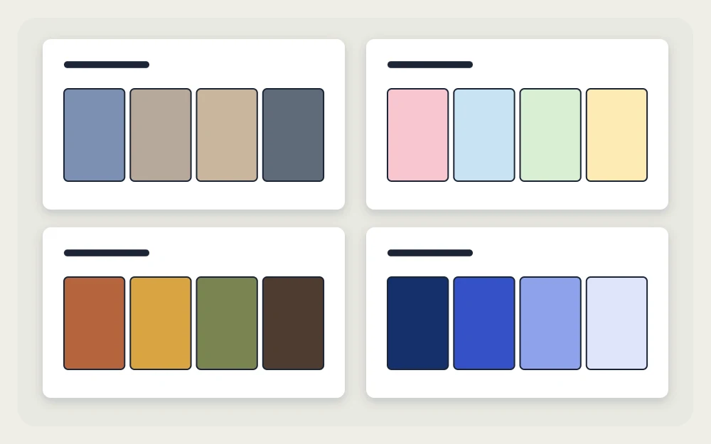
Muted palettes suit work or study spreads where the writing should lead. Pastels need a firm neutral, or the page reads as washed out. Earth tones pair well with cream paper. Monochrome blue is the easiest starting point: every shade agrees with every other, and the darkest one doubles as your writing color.
Make a swatch page before you commit
Colors look different on paper than on the pen cap, and different again on cream paper than on white. A swatch page takes about ten minutes and lets you find that out before a finished spread does.
- Turn to a page near the back of your notebook and leave a line for a label above each candidate palette.
- Draw a row of squares, each 3 by 3 dot-grid squares, with one empty square between them.
- Fill one square per pen and note beside it which pen it came from, by type and color.
- Under each square, draw a thin line and write one word in that color to see how it reads as text.
- Let everything dry, then turn the page and look for ghosting or bleed-through.
Swatches sit naturally beside a pen test, so if you already keep one, add them there. The guide to the best pens for bullet journaling explains how to set that page up.
Color coding versus decoration
These are two separate uses of color, and mixing them up causes most palette confusion.
Decoration is color that makes a page pleasant and easy to scan: header bars, borders, shaded weekends. It can change every month without consequence. Color coding is color that carries meaning: blue for work, green for home, orange for appointments. It only works if it stays the same from page to page, so it belongs in your bullet journal key.
If you use both, keep them apart. One approach is to code with small marks only, such as a colored dot before an entry, and decorate with larger areas such as header bars. Another is to make the accent your single coded color, meaning “urgent,” and treat everything else as decoration. Limit a code to three or four categories.
Using one palette for a whole month
A palette pays off when you repeat it. Use the same three colors on the monthly log, every weekly spread and that month’s trackers, and the pages look like a set even when the layouts differ.
Apply the main color in the same places each time. If headers are sage green in week one, keep them sage green in week four. The shape-based styles in bullet journal headers are a good place for it, because a filled banner or boxed title uses just enough color to anchor a page.
When the month ends, change one color instead of all three. Keeping the neutral and swapping the main color gives a fresh look with the same pens. For starting points tied to the calendar, see the three-color sets in seasonal bullet journal themes.
Frequently asked questions
How many colors should a bullet journal spread have?
Three is a reliable number: a neutral for lines and writing, a main color for headers and a small amount of accent. A fourth can be a lighter tint of the main color for fills. More than that tends to make headers and priorities harder to pick out at a glance.
Can a palette work with only black and one colored pen?
Yes. Black is the neutral and the single colored pen is the main color. Use it for header bars and day labels, then create an accent without a third pen by drawing a thicker line, a box or a star in that same color beside the entries that matter most.
Should the same palette be used all year?
It does not have to be. Many people keep one neutral all year so the writing stays consistent, then change the main color and accent monthly or by season. Any colors used for coding categories are the exception: keep those fixed, or older pages become hard to read.